skip to main |
skip to sidebar
Before:

After:
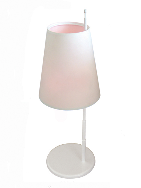
It's a lamp that "blushes" in response to the pitch of a cell phone conversation. It's a pretty interesting concept: humanizing technology, responsive environments. Presumably the pitch of your voice gets higher when you're upset or excited, but being the shrill harpy I am, the lamp would be all pink all the time. which isn't so bad.
This is Anya Kivarkis's neato postmodern-ish take on jewelry:
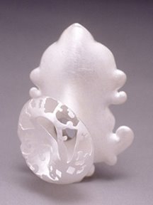
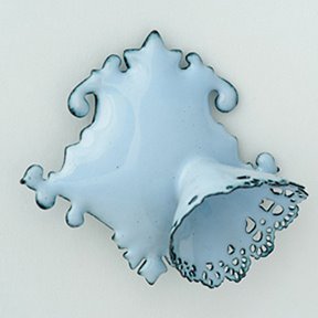 It's a play on Victorian jewelry, using similar shapes and styles, but coated in resin and way cooler.
It reminds me of this chair that I was looking for online today; an acrylic sheet, bent into the approximate shape of a chair, with a formal-sitting-room-looking chair printed onto it. It's really neat, and I was going to blawg about it, but I couldn't find it.
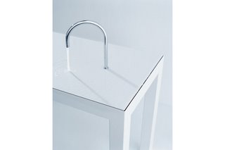
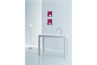 How simple. Sieger Design's Alape washing table is nuts. It's just a spigot coming out of a table, pouring onto the table. Lovely for a public restroom or a half-bath, not so practical for a real bathroom. I wouldn't want to spit toothpaste on it, plus I would forget that the whole thing was a sink and try to put my stuff all over it.Detail of the faucet running water on the table:
All of the political issues aside, this building is just silly: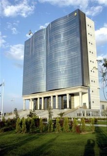 It is the ironically named "House of Free Creativity," in Ashgabat, Turkmenistan. You'll never guess what they keep inside.
Dumb:
This is a nice idea, how it's modeled after old mesopotamian pottery, and it looks so simple and uncluttered. Now think about holding it. Full of scalding hot tea. And trying to drink or pour from it. It's impractical. You would have to hold your wrist at such a dumb angle to avoid pouring it all down your front. The bulb handles look like they would feel nice in your hand just to hang onto while the mug's still warm but you're done with your beverage, but that's about it. And I'm not saying that the current ear-handle design of most coffee mugs is perfect, but it's definitely better. After considering the human body's interaction with products as we have been in studio, this just seems silly.
La Familia, Ole Jensen, www.normann-copenhagen.com.
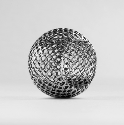
This chair is pretty ugly.
 According to the site, which is a wealth of information, it's polyester impregnated with resin, which was one of the materials I used in the last project. I feel like my case studies looked better than this, but I can appreciate the fact that this stuff gets unwieldy and smelly when you're working with it.
Treehugger's timeline of Earth's recovery from human inhabitation if all of civilization was wiped out at once:
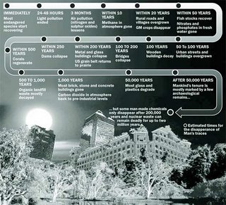 Some people might think this is creepy or depressing, but I am not one of those people. I think it's great, and would love to be alive to see it (logic isn't my strong point).
 Ta-da: the first LEED certified home. Tom Kelly, who is interestingly enough a developer, built this house with all kinds of energy-saving features. It's a 2,000 sqft, "'net-zero energy use' home, meaning over the course of a year, its photovoltaic panels will track the sun and are projected to generate more electricity than the home will consume." I personally like the fact that there is no "lawn," per se, just rocks and shrubs. Treehugger had this picture:
 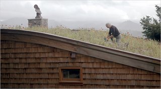 Which is weird, because it's not at all of this house. But when I saw it, I got all excited, because it looked very Laura Ingalls Wilder.

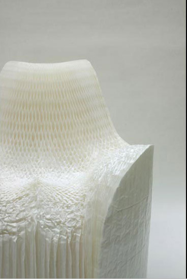
The Honey Pop chair, by Tokujin Yoshioka, is an interesting concept. It's pleated paper, like those holiday decorations you get at Winn-Dixie, but couch-shaped. You spray it with water and sit on it, and move it around you until it conforms to the shape you want. It's a one-shot deal, more for the initial experience than anything, but it's an interesting method of creating it. Once again, thanks Yuichi for pointing it out.

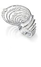
Jewelry design is pretty fantastic. It doesn't seem like something that every silly little girl wants to do, like some of the other corners of the design trade (i'm looking at you, fashion), and it could be a cool area to work in. I took clemson's lapidary arts class, and it was super, despite the fact that it was for 3 hours at 6PM on a Wednesday. Some examples from the Design Innovation Award, 2006 (Several of the pieces look like mall jewelry; the others are delightful) :  Georgia Wiseman's ring of rings, from Scotland.
whirlwind ring, by Alexa Blampied:
 although I couldn't find a very good picture of this one, it looks like it could've been made in Form-Z, which puts an interesting perspective on scale in those programs. I know engineers use 3d modeling all the time for designing parts, and that's most likely what the programs were created for, but it's interesting seeing something created entirely for aesthetics that could be done. in other news, platinum isn't really the best material for making jewelry out of; it's not that shiny, mostly just rare.

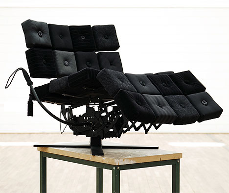
Praline Noir, by design student Fredrik Kjellgren, the fanciest recliner you'll ever see (although I'm not sure why it's sitting on that table). The opposite of the squishy beige one that came with my apartment. Kjellgren came up with the idea by considering the concept that most easy chairs are, in fact, big, squishy, and ugly.
Funny, I mentioned researching "human-informed" furniture the other day, and someone asked if I meant La-Z-Boys. Not exactly. Not necessarily this, per se, but this is delightful just the same. Black, utilitarian, seemingly comfy, and crumbs fall right through, onto the floor, where you can ignore them. Each cushion is made of a different material, giving it an eclectic charm, but the fact that it's all black keeps it from looking like hippie furnuture.

On the subject of mass customization, Yuichi told me about something cool: A-Poc. It means "a piece of cloth," and that's what it is. A continuous tube of dress, able to be customized by the user; they control lengths of sleeves, skirts, shirts, anything. which is nice if you're 5'9". Probably nice if you're short, too, but I'm not, so I don't relate.

Another cool aspect is that it's an additive process, rather than the normal subtractive process used to make most clothing, which means almost no waste in the formation process. As quoted from the site, thread goes into a machine and re-emerges as a complete project, be it clothing, accessory, or even furniture.
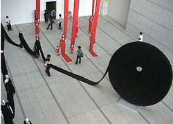
This is a totally bizarre video.
The project is called "Dynamic Terrain," by janisland, and it certainly took a lot of work, but the movement of this thing grosses me out a little. It reminds me of the bog of eternal stench from Labyrinth.
The concept of a plane (wall, floor, ceiling?) being able to adjust to suit different functions is a perfectly acceptable one. I would definitely like to play around on this, if nothing else, and I guess the speed of the undulations (plus the weirdo music) is just to exaggerate the concept. It's still like something from an alien movie, though.
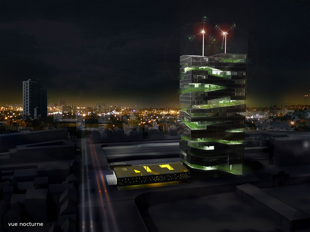
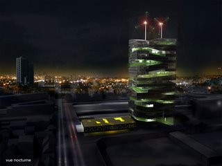 I saw this image first in an Autodesk advertisement in a magazine. It's cool to see a company showcase something like that in an ad; i guess the drawing was made with Autodesk. Whatever, that's not the important part. Vertical farming is apparently a well-studied concept. This particular one is called, "The Living Tower," and it's by Pierre Sartoux. It's an interesting idea, but thinking about it too much makes me mad. seriously? scraping all the topsoil off plantable land to make housing developments, then building skyscrapers to house farmland. it seems like people have their priorities backward. nevertheless, it will sadly become increasingly relevant.
More on vertical farms.
Our current project design parameters have nothing on minihome. At a bitsy 400 square feet, this house is technically defined as an RV (it has wheels), but its intent is to be used as whatever you want, wherever you want it, although I wouldn't particularly want it anywhere in Tornado Alley, because it's still a very portable home. It's modernist, but I have no problems with modernism.
 From the outside it looks like a trailer and a diner had a baby with school spirit. But it is interesting.
There aren't any good, cohesive shots of interior spaces as relative to other interior spaces, possibly because the whole thing is so small you can't back up far enough to take a comprehensive photograph.
The bathroom's pretty cool, though:

This is what tomatoes look like inside your new minihome:
 The website has a really good FAQ, if you're interested in reading more.
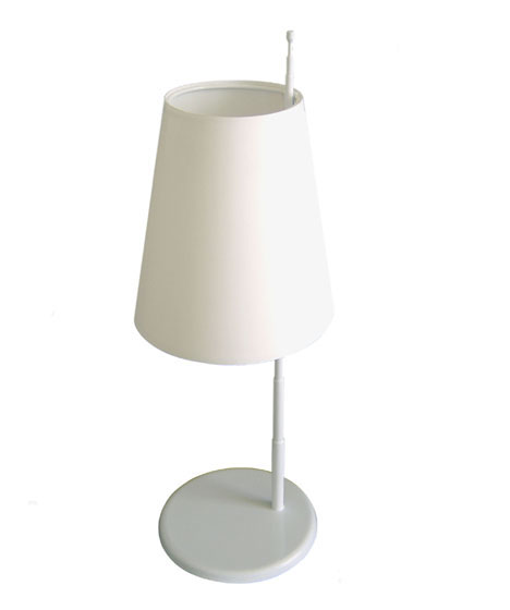
continuing from my last project with the concept of the unexpected, these lights, by iris design studio, are super:
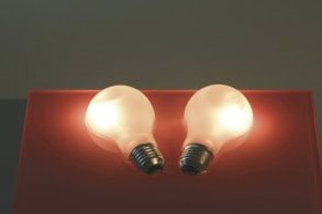
 this one caught my eye, considering I thought throwing a light bulb and a 9v battery in a bowl of salt water would work. apparently this light bulb is just used as a shading device, and there is actually a halogen bulb or something like that inside it. the incandescent bulb is cut in half and mounted in a resin bed, and its reflection makes it look whole.
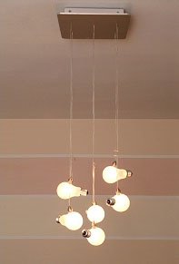 these presumably work in the same way, halogen bulbs inside; it mostly just looks neat. although i wouldn't really want an unshaded lamp.
I'd never really cared about going to Austria until I saw this in Architectural Record: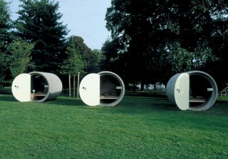 I would 100% stay in one of those. If you don't feel like following the link at the bottom, I'll sum it up here. Designed by Andreas Strauss, Dasparkhotel (The Park Hotel? I'm not German) is minimal and cool. The 9.5-ton concrete tubes are sealed with a clear varnish to keep out moisture, and the thickness of the walls is enough to keep renters cool. Each appears to have a bed, table, lamp, skylight, and cheerful painting on the back wall, which I guess you would need if you were sleeping in construction materials.
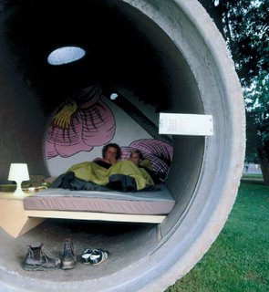
www.arplus.com/broch/articles/july%202006%20pdfs/arjul06straussdone.pdf
 here's the product I envisioned using in my last project: LiTraCon. It's light-transmitting concrete (hence the name) that does so by embedding fiber optics (I mistakenly thought it was glass fiber) in concrete. Created by Hungarian architect Áron Losonczi, this stuff is pretty sweet. on the site it looks to be small modules, where I had envisioned my entire building to be a relatively monolithic pour, regardless of real-world feasibility.
LiTraCon homepage: http://www.litracon.hu/
where this image usually lives: http://www.techeblog.com/index.php/tech-gadget/light-transmitting-concrete


 How simple. Sieger Design's Alape washing table is nuts. It's just a spigot coming out of a table, pouring onto the table. Lovely for a public restroom or a half-bath, not so practical for a real bathroom. I wouldn't want to spit toothpaste on it, plus I would forget that the whole thing was a sink and try to put my stuff all over it.
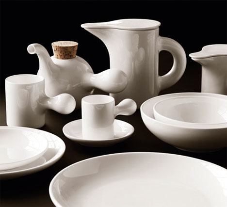
 According to the site, which is a wealth of information, it's polyester impregnated with resin, which was one of the materials I used in the last project. I feel like my case studies looked better than this, but I can appreciate the fact that this stuff gets unwieldy and smelly when you're working with it.
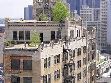

 Some people might think this is creepy or depressing, but I am not one of those people. I think it's great, and would love to be alive to see it (logic isn't my strong point).

 Georgia Wiseman's ring of rings, from Scotland.
 although I couldn't find a very good picture of this one, it looks like it could've been made in Form-Z, which puts an interesting perspective on scale in those programs. I know engineers use 3d modeling all the time for designing parts, and that's most likely what the programs were created for, but it's interesting seeing something created entirely for aesthetics that could be done. in other news, platinum isn't really the best material for making jewelry out of; it's not that shiny, mostly just rare.

 I saw this image first in an Autodesk advertisement in a magazine. It's cool to see a company showcase something like that in an ad; i guess the drawing was made with Autodesk. Whatever, that's not the important part. Vertical farming is apparently a well-studied concept. This particular one is called, "The Living Tower," and it's by Pierre Sartoux. It's an interesting idea, but thinking about it too much makes me mad. seriously? scraping all the topsoil off plantable land to make housing developments, then building skyscrapers to house farmland. it seems like people have their priorities backward. nevertheless, it will sadly become increasingly relevant.
 From the outside it looks like a trailer and a diner had a baby with school spirit. But it is interesting.
 The website has a really good FAQ, if you're interested in reading more.
 You can't, because it 100% does. or at least 60% -- the bottom 60%. Thomas Heatherwick designed this for Longchamp, which appears to be a women's retailer, or one that makes really feminine man-purses. They describe it pretty accurately as a landscape, rather than a staircase. These photos make me want to climb up it lengthwise, which is probably frowned upon, considering I'd have to hop over the railing that is likely there for a reason.
 It's nice to see that bendy shapes don't have to be completely lawless in terms of geometry; this shot shows beautiful symmetry through the change in elevation:
 I scanned the images from "Architectural Record," which explains the magazine-y text.
 this one caught my eye, considering I thought throwing a light bulb and a 9v battery in a bowl of salt water would work. apparently this light bulb is just used as a shading device, and there is actually a halogen bulb or something like that inside it. the incandescent bulb is cut in half and mounted in a resin bed, and its reflection makes it look whole.
 these presumably work in the same way, halogen bulbs inside; it mostly just looks neat. although i wouldn't really want an unshaded lamp.